Dump your bad usability decisions
You are shitting on your users. Yes, you. You, the web site linking to important content from within Flash objects.
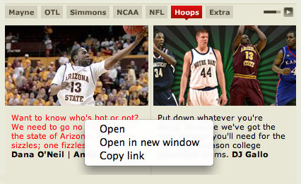
There is a special place in Hell for you in particular, ESPN.com. You entice visitors so seductively with your shiny graphics, strong visual structure, and rich content. Then you release an agonizing flow of liquid turd all over their browsing habits.
You have so much great content. Users want to visit your homepage regularly, hold down the “command” key, and open links to all your great content in background browser tabs, where the content can be read with ease and efficiency.
But no. You deny users the choice of how to open their links. You choose to embed links to your best features inside a tabbed Flash piece. You choose to shit on your users on a daily basis.

No “Open this in a new tab” option? You've gotta be shitting me. The “Copy link” option only sometimes works, other times linking to such useful URLs as “asfunction:_root.getLink,5|1”
Why? Why isn’t this in Javascript? Why are you using a plugin that breaks browser convention? Why are you shitting on your users?
Flash is fatally flawed when used in this context. I do not know if fault for Flash’s inability to communicate with browser tabs rests with Adobe or the browser makers. I do know that when you choose to use Flash in this manner, you are shitting on your users.
Now, several newspaper sites I work with, TCPalm.com is one example, use Flash to display rotating featured stories atop their homepages. This will change in the next round of revisions, as there is no excuse for Flash to remain linking to such prominent content.
There are few usability issues more frustrating than having to use the “Back” button to load a homepage again just to click a link to each desired story. Please, ESPN.com and the rest of the internet, do not embed your links inside Flash objects until the Flash plugin allows links to be opened in browser tabs.
Flush the Flash down the toilet, and keep the feces out of your users’ faces.
Discussion