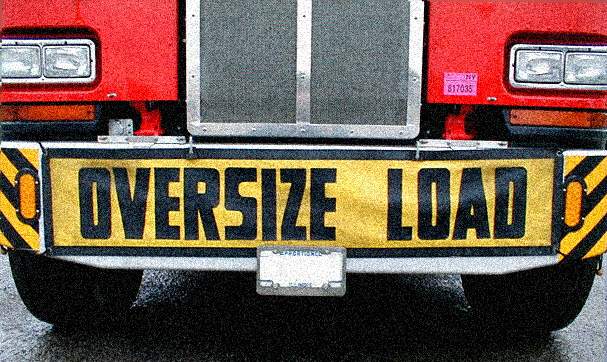
Caution: Wide Load
While attempting to find the optimal width for designs targeted at users with screens 1280px and greater, Cameron Moll recently asked, “Is it time to move beyond 960?”
I sure hope not. Do we really need the extra space?

Cases in which an extra couple hundred pixels in width would enhance the functionality or presentation of a site certainly exist, but aren’t the norm. Instead, most websites will actually be burdened by the increase in girth.
How could using more width be detrimental to a website?
No one likes a long line - people often lose interest before they reach the end. This is especially true when referring to how we read lines of text. Robert Bringhurst has this to say on the subject:
Anything from 45 to 75 characters is widely regarded as a satisfactory length of line for a single column page… The 66-character line (counting both letters and spaces) is widely regarded as ideal. For multiple-column work, a better average is 40 to 50 characters… even with generous leading, a line that averages more than 75 or 80 characters is likely to be too long for continuous reading.
The line length of entries here at ryanberg.net is already dangerously long, at approximately 84 characters. Comments and other content pieces on this site that span the entire width of the page get as long as 125 characters. Well, shit.
To target this layout for a wider resolution, I’d have to significantly increase the font size or risk an overwhelming line length becoming a barrier to reading my copy. This paragraph is already set at 16px. How big can it comfortably go?
Instead of bumping the font size of existing content, I could choose to add an extra column of content with more info, links, etc. But adding gratuitous columns will disrupt the eye’s movement down the page. The more columns in a layout, the more work a user has to do to scan or consume its content.
To see what I mean, scan The New York Times for health-related news, and then do the same on MSNBC. The many-column layout of The New York Times forces the eye to move up and down, left and right over each column to scan for information. MSNBC’s primarily single-column layout of topics means the eye only has to move in one direction down the page.
Rather than ask if it’s time to move beyond 960, let’s make sure anything beyond 960 is worthwhile.
Discussion