Quit distracting your users
Are you helping your users accomplish their goals?
Each user of your site has one or more tasks in mind. Common tasks include:
- Discovering interesting content to read
- Finding information on a product or service
- Buying a product to satisfy a want or need
You may also have goals for each visitor to your site. These goals can include:
- Keeping a reader from bouncing to another site
- Highlighting a new or profitable product or service
- Selling a product with high-margin accessories or related items
In too many situations, websites let their own goals dictate design decisions without giving proper thought to a user’s experience while attempting to complete a task.
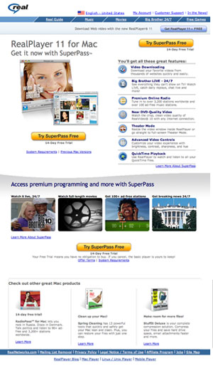
Consider a user who has just found out he needs to install Real Player to play a video he has been sent. This typical visitor to Real.com is greeted with almost an entire page devoted to selling a $12.99/month SuperPass subscription, with only a lonely blue button on top linking to the download page for a free player. Even the title of the page, “SuperPass for Mac” - premium audio and video programming” prioritizes the subscription service.
This is worse than an onslaught of Make my logo bigger; not just tasteless, but downright disrespectful to its users.
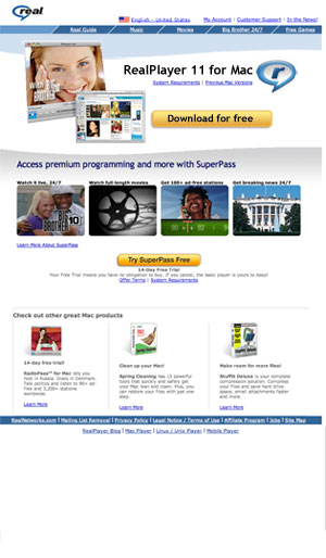
The more balanced approach would be to make it obvious and easy to reach the free player download page, and as the user is satisfied and downloading the application, offer the happy user an easy upgrade path. Heck, go one step further and let the free version be downloaded straight from a large presence on the homepage, with upgrade prompts respectfully below.
Real needs to learn that disrespecting users is not a long-term business plan.
In the brick and mortar world, Circuit City learned this lesson the hard way after burying low-price but high-volume items like CDs and DVDs in the back of their stores. This forced customers only ready and willing to part with $10-$20 to walk past big ticket items like stereo systems and big screen TVs. Best Buy came to dominate the electronics market in part by placing inexpensive media at the front of its stores, making the purchasing process an easy affair. Satisfied customers associated Best Buy with a positive buying experience, and returned to buy big ticket items when they were ready. Circuit City was eventually forced to rethink its store layouts to match, but not before significant damage was done.
In each of the above examples, the wants and needs of customers were pushed aside in poor attempts to fulfill corporate agendas.
On the web, sites have two qualities that, when properly enhanced, will lead to a successful balance of user and company satisfaction.
The first, findability, is the ease with which a user can find appropriate information and tools on a website to complete intended tasks. Findability is enhanced by designing with clear hierarchy, straight-forward navigation, and effective search features.
The second, discoverability, is the ease with which a user can be introduced to information and tools on a website to create interest in completing new tasks. Discoverability is enhanced by designing with clear hierarchy, carefully directing a user’s focus to points of emphasis, and utilizing clear calls to action.
By designing for both findability and discoverability, you help users complete tasks and guide them toward satisfying corporate needs. Put the user first, and you both win.
Discussion