Bizjournals homepages
Homepage redesign for 43 local business journals
Stakeholders feared the proposed design of the homepage for 43 local business journals would not just fail to increase sales of our products and services, but would actually reduce reader engagement with our core news content — damaging crucial, previously-stable revenue streams.
I rapidly built and A/B tested prototypes — fusing my design process, HTML and CSS expertise, and technical improvisational instincts — that identified the actual negative impact of the initial proposed design, created alignment on how we might acheive our business goals by improving the experience for our users, and validated the positive impact of changes through subsequent iterations.
Overview
About The Business Journals
The Business Journals—a network of 43 local business journals across the United States—do far more than just publish business news for customers to read. But many customers aren’t aware that their local business journal also offers numerous tools and services to help grow their businesses and advance their careers, such as finding sales leads, promoting new hires, or posting job openings.
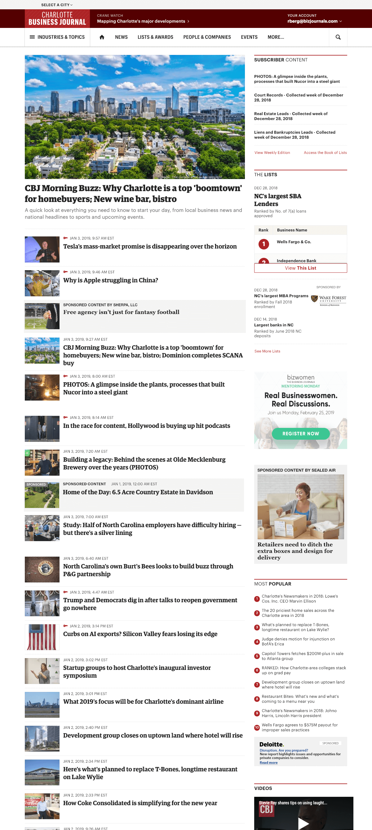
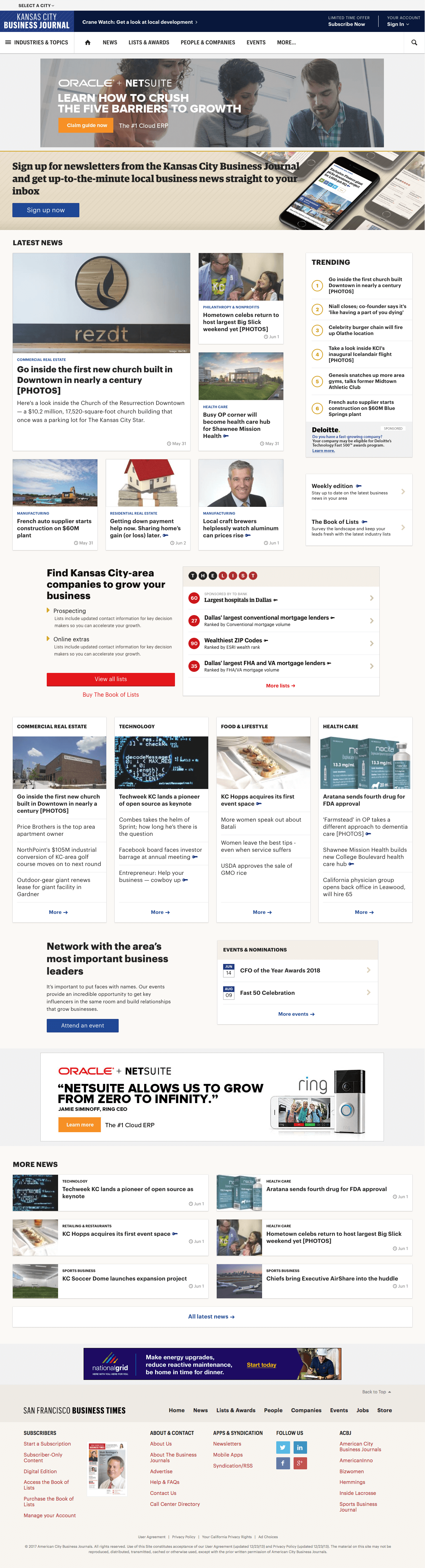
Existing homepage
The existing homepage was dominated by a reverse-chronological feed of headlines. Promotions for lists, jobs, events, and more were confined to an easy-to-miss sidebar. Analytics indicatee that users rarely engaged with these products and services.
Goals
This project sought to use each local business journal’s homepage to showcase the breadth of our offerings—while maintaining the level of traffic the existing homepages sent to news content. The new homepage would also have to provide enough display advertising and sponsorship placements for parity with the existing homepage.
Research
Customer survey
The design team, in partnership with our marketing research team, surveyed Bizjournals.com visitors to learn about their top professional challenges. Three stood out from the rest:
- Finding the right clients
- Finding and keeping the right employees
- Having enough time to do everything on their plate
User interviews
We followed up the survey with more than a dozen in-depth interviews with current Business Journals subscribers. These interviews made it clear that although we have products that can help customers find clients or hire better, even our most avid users had minimal awareness of them.
For both new visitors and loyal subscribers, we needed to do a much better job of explaining how content and products from The Business Journals could help their businesses and grow their careers.
Early design work
The team set out to tell the story of how a user's local business journal can help them in their career. Based on our research, we organized the story around four themes:
- Keep your finger on the pulse of the local business community.
- Find the right clients to grow your business.
- Hire and retain the best employees.
- Reach our audience with your message.
My role in this early phase of the project was often hands-off, largely supporting the team's design efforts by leading critique sessions. Later I was asked to build the HTML and CSS for a test of the design. I polished off some rough edges of the design as I handled its implementation.
First minimum viable product (MVP)
Development
With the support of a back-end engineer to pass data to the template, I wrote the HTML and CSS to execute the design, and configured an A/B test using Visual Website Optimizer (VWO) to redirect a small portion of traffic to the new experience.
Results
- Content related to our products and services received fewer clicks in the test than in control.
- News headlines received significantly fewer clicks in the test than in control.
- The most-clicked element in the test was the “See more news” button, that expanded the top portion of the page to reveal more headlines.
As the numbers came in, I was ready with ideas for how we could pivot, iterate, and meet our objectives.
Second iteration
Hypotheses
- Visitors to our homepages are primarily seeking the latest headlines.
- If we spread news content through the whole page (not just the top section), users will be more likely scroll.
- If we promote our products and services in proximity to news headlines, users will be more likely to engage with them.
Development
To test these hypotheses with minimal investment, I used Javascript to manipulate the initial test page so that all the headlines were displayed by default, and inserted modules for a data product and event promotions.
Results
- Content related to our products and services received significantly more clicks in the second test than in control and the first test.
- News headlines received almost as many clicks in the second test vs control, despite far fewer headlines on the page to click on.
Takeaway
This structure had potential! With everyone now on the same page, I received buy-in from the product team and stakeholders to explore how the homepage should be designed when driven by these ideas.
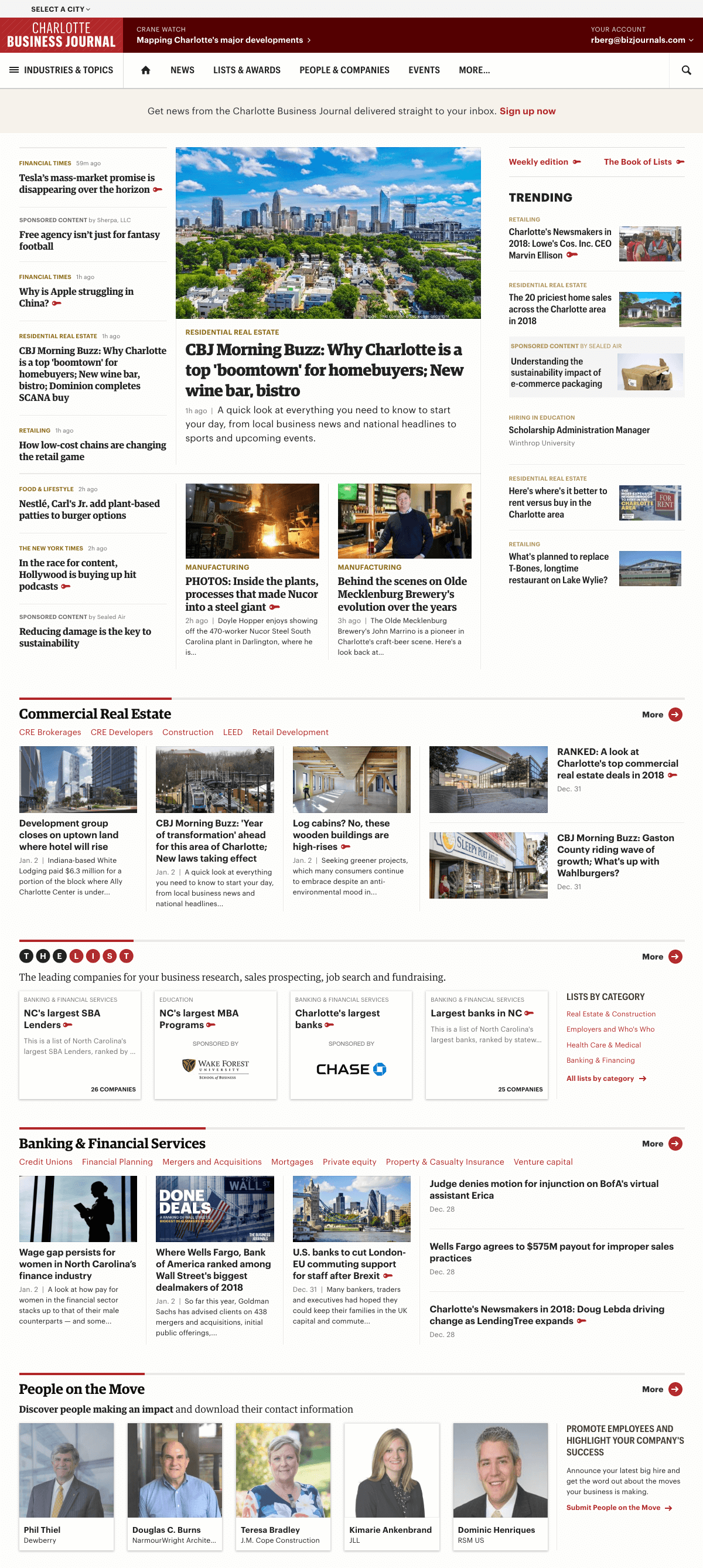
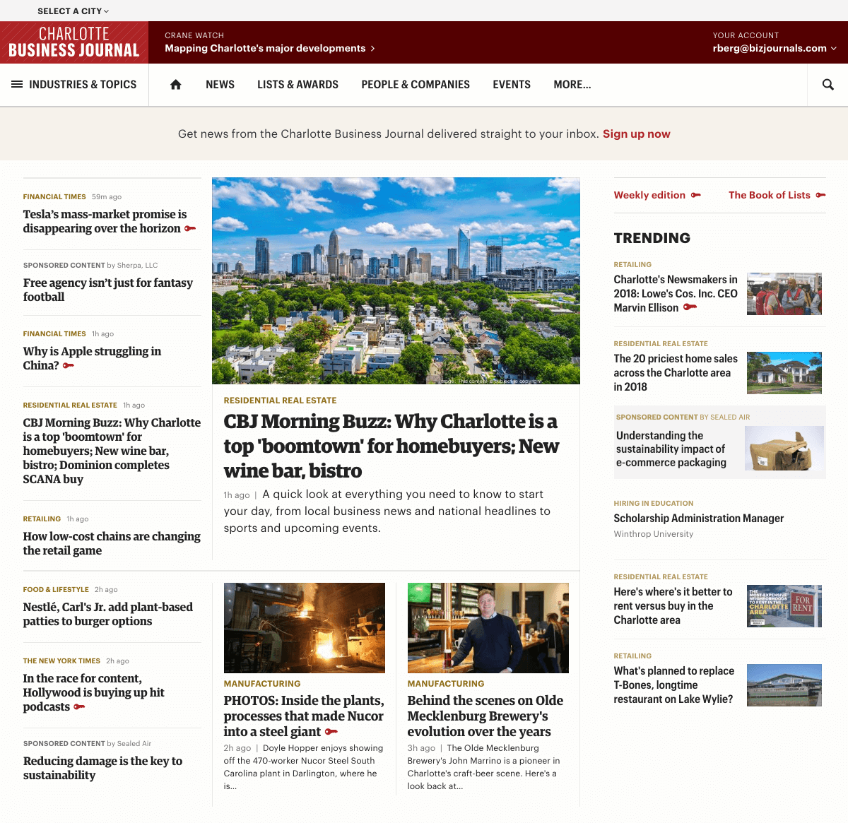
Third iteration
Design
We’d repeatedly heard from our customers that they wanted to be able to find news by industry or topic on the homepage. With this in mind, I organized the page so that the top headlines area is followed by a module for each industry our publications cover, like commercial real estate. Content related to products and services were positioned in between each industry, along with an explanation tying the content to our users’ potential goals, like finding new clients. Users scrolling down the page because they want to scan more headlines or find an industry that interests them will be naturally exposed to our products and services.

Development
I used this homepage design as a first pilot project for developing using utility classes and Sass variables from an early version of the Blazer design system I had also been working on. I was pleased with how little custom CSS I had to write to implement the design.
Much of the CSS I ultimately wrote was to arrange items in the top headlines area. I turned to CSS Grid, a first for our website, to execute the challenging structure required to visually balance elements across multiple columns while accommodating a dynamic number of headlines.
As with the first iteration, I had the support of a back-end developer who made sure the templates had access to all the necessary content from our database and APIs.
I once again configured a test using VWO to send a small percentage of traffic to this new iteration, and connected click tracking to our standard analytics platform to ensure an apples-to-apples comparison versus control.
Results
Consistent with the second iteration, content related to our products and services received significantly more clicks than in control, and news headlines received almost as many clicks as in the control. Overall, this was a win for both the business and our users.
Final steps
To focus effort on what mattered most for these tests, we had embraced a handful of helpful constraints like not integrating new ad formats and not optimizing the page’s loading time. Now with data from the third A/B test instilling confidence, the product team was ready to move forward with the new homepage design. I worked with one of our agile scrum teams as they scaled my MVP to support the full requirements of the business and our newsrooms, paying particular attention to page speed, revamped ad formats, and content management system workflows.