Design system color palette generator
An essential tool for generating an accessible, versatile, vibrant color palette at The Business Journals
Color requirements
As part of the foundation for The Business Journals' Blazer design system, we needed brand color palettes up to the task of supporting all our digital efforts. Blazer's color palette would have to be:
Accessible
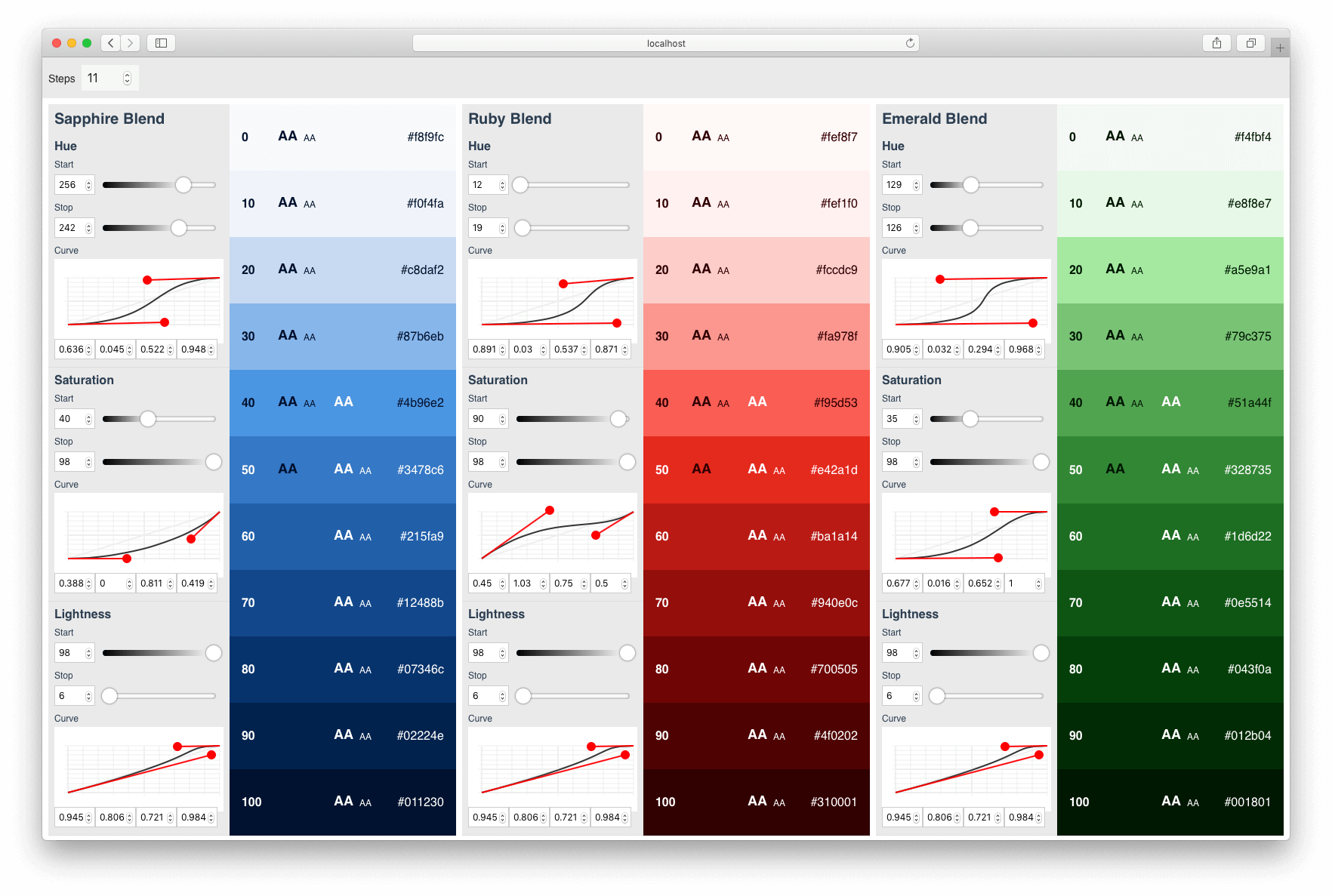
Colors pass WCAG standards for color contrast, with each corresponding step of the Sapphire, Ruby, and Emerald scales having identical contrast scores against white and black values.
Versatile
Colors should be available to support to a wide range of use cases, from subtle backgrounds to attention-grabbing buttons.
A bit more vibrant
Colors for interactive elements feel more actionable, while still feeling professional.


Tool analysis
Creating a color palette to meet those requirements across three themes by hand would be prohibitively-slow and imprecise. To complete this task, I needed to use one or more tools to minimize friction while exploring the wide range of possible color settings. There are a bunch of really great tools serving this need. But each tool I tried fell short in one or more ways:
Color uniformity
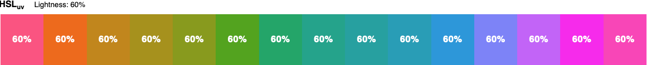
Design and development tools often use the HSL color space to specify and generate colors. But the math behind the HSL color space is fundamentally disconnected from the way people perceive color. Color scales generated by these tools won't have identically-perceived brightness and contrast ratios across our Sapphire, Ruby, and Emerald brand themes, so they aren't well-equipped to satisfy our accessibility requirement.
The HSLuv color space was recently developed as a human-friendly alternative to HSL. Manipulating colors using HSLuv would help ensure that Sapphire 60, Ruby 60, and Emerald 60 values would each have the same contrast ratios against white and black. But tools using HSLuv are scarce and immature.
Color steps
Most color scale generators distribute each color linearly between the beginning and end of the range. To generate a versatile palette that could be applied across a variety of use cases from subtle backgrounds to attention-grabbing buttons, we needed a tool that would let each scale be adjusted along a curve to output more colors clustered toward the beginning, middle, or end values of each range.
Palette context
Generating one accessible, versatile color scale is challenging enough. But we needed a tool that would display advanced controls for multiple scales at once so we could create a completely cohesive palette.
Custom solution
Since I couldn't find the right tool for the job, I started making one! After an initial proof of concept I built up a Vue.js application that provides an interface for generating colors.
The application features:
Immediate visual feedback
The application is reactive, with immediate visual feedback for every adjustment made to each color input.
Uniformity across hues
All color functions are calculated using the HSLuv color space, which ensures uniform brightness across all hues.
Accessibility
Each color step is labeled with WCAG color contrast grades for small and large text against white and black values.
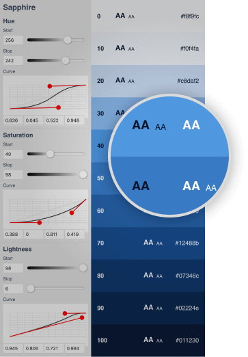
Adjustable curves
Colors are distributed in steps along a curve between the start and stop values for hue, saturation, and lightness within each scale. Each curve is derived from coordinates which can be manipulated to output steps evenly across a range, or cluster values more toward the beginning, end, or anywhere in between.
Natural interaction
The math that translates polor coordinates into curves is difficult to manipulate with confidence. To facilitate more deliberate explorations, I plotted each curve on an interactive graph that can be modified without needing to internalize the underlying math. Curves can now be adjusted as easily as lines in any vector drawing app, like Sketch or Illustrator.
Design system integration
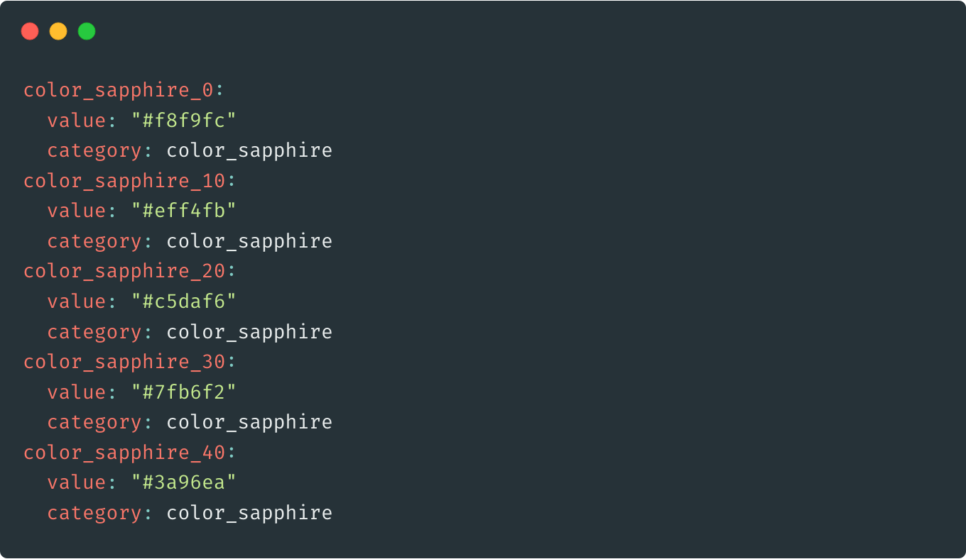
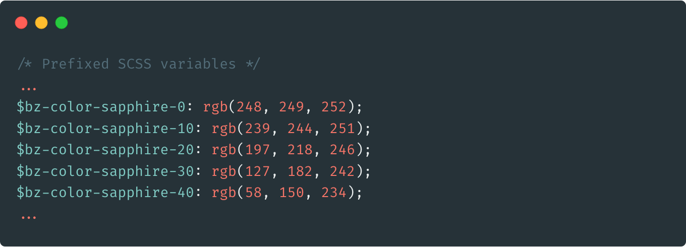
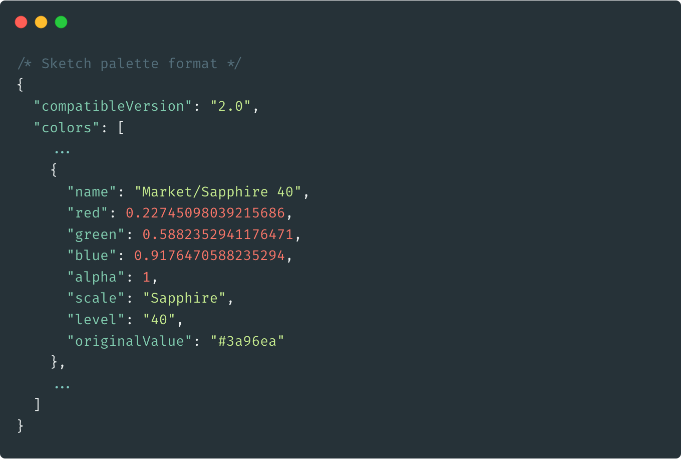
With one click, each scale can be exported as design tokens in a YAML format digestible by our design system codebase. The design system then translates the tokens into SCSS variables for use in code, and JSON for import into Sketch color palettes. This made it efforless to validate adjustments made to the colors in actual context within our designs.